Eberhart’s Embroidery – Website Build

A complete WordPress website build for Eberhart’s Embroidery, designed and built in Elementor with clean, SEO-first structure baked in from the start.

Eberhart’s Embroidery needed a full website, and this was one of my first complete site builds from the ground up. I built the entire site for the client in WordPress using Elementor, and I treated SEO as part of the build itself rather than an afterthought, so the structure was clean and search-friendly from day one.

The Build

I built every page of the site in Elementor, keeping the layouts clean, consistent, and easy for the client to maintain. The goal was a professional, well-organized site that represented the business well and gave visitors a clear path through its services.

Built for SEO

The part I’m proudest of on this build is the SEO. I set it up properly across the whole site, with a clear heading hierarchy on every page, thoughtful internal linking between related pages, clean metadata, and dedicated pages built to target the terms that matter to the business. It was the full package, done the right way.

What I Did

  • Full site build. Designed and built the entire website in WordPress with Elementor.
  • Heading hierarchy. Structured every page with a proper H1 to H2 to H3 order so both readers and search engines can follow it.
  • Internal linking. Connected related pages with intentional internal links to spread authority and help people navigate.
  • Page metadata. Wrote clean page titles and meta descriptions across the site.
  • SEO landing pages. Created dedicated pages aimed at the search terms the business wanted to rank for.
  • Clean, responsive build. Made sure the site looked and worked well across devices.

Tools and Tech

  • WordPress. The platform and CMS for the whole site.
  • Elementor. Used to design and build every page.
  • On-page SEO. Metadata, heading structure, and internal linking throughout.
  • HTML and CSS. For custom touches where they were needed.

My Role

I built the whole thing for the client, from the WordPress setup and the Elementor pages to the SEO structure underneath. As one of my first full site builds, it’s where I locked in the habit of treating SEO as part of the build from the very beginning.
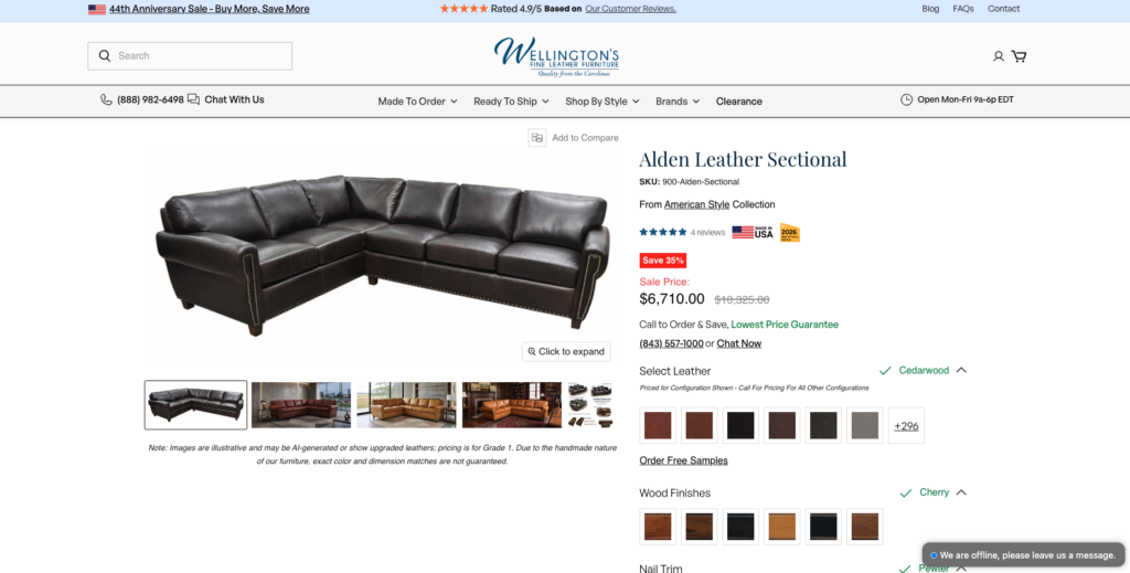

An ongoing, phased set of enhancements to Wellington’s large Shopify furniture store — custom collection behavior, guided product options, price-dependent warranties, and a steady stream of design and functionality changes delivered over several months.

Wellington’s Fine Leather Furniture wanted a wide range of improvements to their store, and rather than one big-bang launch, we planned and shipped them as phases over the course of months. The work spanned how certain collections behave, how customers configure their furniture, how warranties are priced, and dozens of smaller refinements across a big, highly custom site.

What I Built

  • Phased delivery — planned and rolled out changes in stages over several months, keeping the store stable while the work progressed.
  • Collection-specific behavior — for certain collections (like sectionals), the store hides pricing entirely and replaces the usual buy path with a button that routes the shopper to call the business. Some collections deliberately withhold details like price so customers reach out directly.
  • Guided product options — implemented staged selection with swatches so customers can easily pick their leather type, cushion type, finish, and other options as they build their piece.
  • Price-dependent warranties — warranty options that scale with the item being purchased, so higher-value furniture carries a proportionally higher warranty price.
  • Site-wide refinements — a long list of smaller design and functionality improvements applied across the store throughout the engagement.

The Challenge

The biggest challenge wasn’t any single feature — it was the size of the site. Wellington’s store is large, with a lot of moving pieces and custom functionality built up over time. Getting a full understanding of how it all fit together took real time, and every change had to be made carefully: the priority was making sure a fix or addition in one place didn’t quietly change or break something elsewhere, and that nothing overlapped or conflicted across the site.

Tools & Tech

  • Platform: Shopify, working within a large custom theme in Liquid.
  • Front end: HTML, CSS, and JavaScript for the option selectors, conditional collection behavior, and warranty logic.
  • Data: Shopify metafields to drive collection-specific rules and product configuration.

My Role

I carried out the work across every phase — learning the existing custom store in depth, then implementing the collection behavior, the swatch-based product options, the price-dependent warranties, and the many smaller changes, all while protecting the rest of the site from unintended side effects.

An end-to-end website audit of Satya Jewelry’s Shopify store, a full review of the site, a list of design and UX improvements, and then the actual fixes implemented in code and rolled into a new theme.

Satya Jewelry wanted a careful look at their store to find what could be better. I went through the site more or less top to bottom, noting the design and experience issues worth fixing, and then made those improvements directly in the Shopify theme, while making sure their third-party apps kept working and migrating everything onto a new, cleaner theme built for the audit.

The Audit

I reviewed pretty much the entire site, looking for the details that quietly add up to a worse experience: inconsistent spacing, button styles that didn’t match, font sizes that were too small or uneven, and design choices that could be tightened. The goal wasn’t a full redesign, it was to catch and correct the things holding the store’s polish and usability back.

What I Did

  • Full-site audit. Reviewed the store end to end and documented the design and UX issues across its pages.
  • Identified refinements. Spacing, button styling, font sizes, visual consistency, and general design improvements.
  • Implemented the fixes in code. Made the changes directly in the Shopify theme rather than just recommending them, working in Liquid, CSS, and the theme’s sections.
  • Third-party app integration. Made sure the store’s third-party apps were wired up and functioning correctly through the changes.
  • Theme migration. Moved the store onto a new theme, the one created for the audit, bringing all of the fixes and improvements together on one clean base.

Tools & Tech

  • Platform. Shopify, working within the theme’s sections and Liquid.
  • Front end. HTML, CSS, and JavaScript for the design and UX fixes.
  • Integrations. The store’s existing third-party apps, verified through the migration.

My Role

I ran the audit and carried out the work, reviewing the site, identifying what to improve, implementing the fixes in Shopify code, keeping the third-party apps integrated, and migrating the store to the new theme.

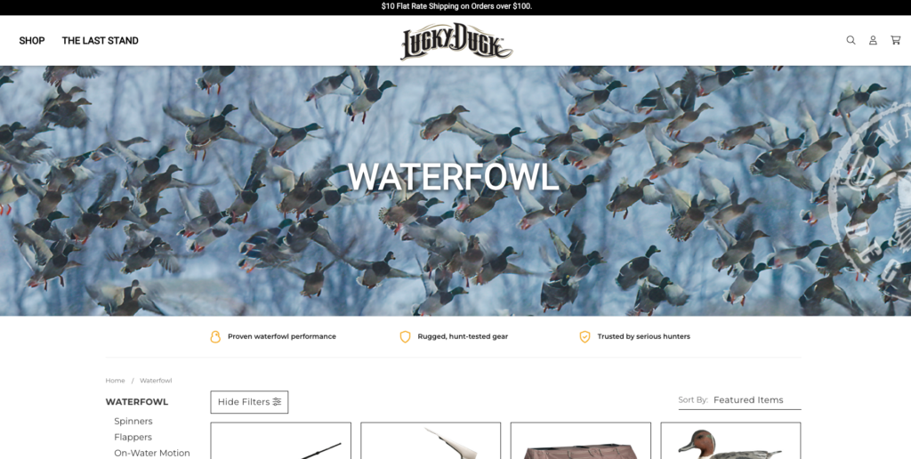
A full accessibility audit and remediation of luckyduck.com, every major page reviewed against WCAG standards, then fixed so the store is compliant and genuinely usable for everyone.

Lucky Duck needed to know where their store stood on accessibility and, more importantly, to fix what was falling short. I audited all of their major pages against the Web Content Accessibility Guidelines (WCAG), documented the issues, and then carried out the remediation, turning a list of problems into a store that meets the standard employers, customers, and regulators expect.

Why It Matters

Accessibility isn’t just a legal checkbox, it’s a better, more inclusive experience for every shopper, and non-compliance carries real risk for a business. The goal here was conformance with WCAG 2.1 at the AA level, the benchmark most organizations are measured against, evaluated across its four core principles: content should be perceivable, operable, understandable, and robust.

What I Did

  • Audited every major page against WCAG 2.1 AA success criteria, combining automated checks with hands-on manual testing.
  • Documented the issues. Insufficient color contrast, hard-to-read typography, missing or improper semantic structure, unlabeled controls, missing image alt text, weak focus indicators, and keyboard-navigation gaps.
  • Fixed color and contrast. Adjusted colors so text and interactive elements met the required contrast ratios, without washing out the brand.
  • Improved typography. Refined fonts and sizing for legibility and readability across the site.
  • Collaborated with the client. Went back and forth on color and font choices to land on combinations that satisfied WCAG contrast requirements while keeping their brand identity intact.
  • Strengthened the markup. Semantic HTML, proper heading structure, labeled controls, visible focus states, keyboard operability, and ARIA where appropriate, so assistive technology like screen readers can interpret the pages correctly.
  • Re-tested after changes. Verified each fix against the guidelines to confirm the issues were actually resolved.

Standards & Approach

  • Standard. WCAG 2.1, targeting AA-level conformance.
  • Principles. Perceivable, operable, understandable, robust (POUR).
  • Methods. Automated audits paired with manual review, color-contrast analysis, keyboard-only navigation testing, and screen-reader checks.
  • Focus areas. Color contrast, typography and legibility, semantic structure, focus management, labels, and alternative text.

My Role

I ran the audit and carried out the remediation, reviewing the major pages against WCAG, prioritizing the issues, implementing the fixes to fonts, colors, and markup, and working with the client throughout to keep the result both compliant and on-brand.

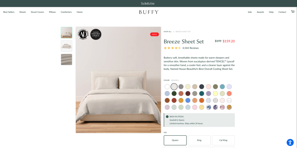
A complete, conversion-focused redesign of Buffy’s Shopify product page, a pixel-perfect build from a Figma design, extended across the site theme, with custom animated sections, redesigned tabs and swatches, and a sticky add-to-cart tuned for both desktop and mobile.

Buffy set out to redesign their product page with one clear goal: give shoppers a better experience and convert more of them. The new direction came from a Figma design, and my job was to bring it to life faithfully, a pixel-perfect implementation of the product page and the surrounding theme, built to feel just as polished on a phone as on a desktop.

The Goal

The product page is where the buying decision happens, so the redesign had to do more than look good, it had to guide shoppers toward adding to cart. That meant a cleaner, more engaging layout, clearer product options, and a purchase path that stayed within reach as customers scrolled, all while matching the Figma design exactly across every screen size.

The Solution

I rebuilt the product page and updated the site’s header and footer to match the new design pixel for pixel. Beyond static layout, I built custom Shopify sections with dynamic movement, redesigned the product tabs and variant swatches to feel more tactile and intuitive, and added a sticky add-to-cart so the purchase action is always one tap away. Every piece was carefully tuned for both desktop and mobile.

What I Built

  • Pixel-perfect product page. Rebuilt the product page to match the Figma design exactly, on both desktop and mobile.
  • Theme updates. Redesigned the site’s header and footer to align with the new look across the storefront.
  • Custom sections with dynamic movement. Built bespoke Shopify sections with custom animation and motion to make the page feel alive and engaging.
  • Redesigned tabs and swatches. Reworked the product information tabs and variant swatches into a cleaner, more intuitive interface.
  • Sticky add-to-cart. Added a persistent add-to-cart section that keeps the purchase action in reach as shoppers scroll.
  • Responsive across devices. Made sure the entire experience held up and felt polished on both desktop and mobile.

Tools & Tech

  • Platform. Shopify, with custom theme sections built in Liquid.
  • Front end. HTML, CSS, and JavaScript, with custom motion and interaction.
  • Design. Figma, as the source for the pixel-perfect build.

My Role

I handled the front-end implementation end to end, translating the Figma design into a pixel-perfect product page and theme, building the custom animated sections, tabs, swatches, and sticky add-to-cart, and making sure the whole experience was smooth and consistent across desktop and mobile.

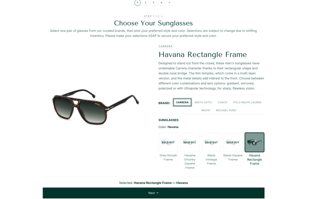
A set of reward-trip gifting sites for Edward Jones’ top performers, built on one reusable Shopify template that gated access to each trip’s attendees and let them claim their free gifts through a clean, effortless experience.

Edward Jones recognizes its top performers with reward trips around the world, and every trip comes with its own set of branded gifts like sunglasses, hats, bags, and more. Each trip needed its own dedicated site where the people on that trip could choose and claim their gifts, and it all had to be repeatable across many different trips without rebuilding from scratch every time.

📷 Screenshot placeholder, trip landing / gift claim site
Replace this block with a real image.

The Problem

There wasn’t one trip, there were many, each with a different destination, a different guest list, and a different set of gifts. The business needed a way to launch a new site for each trip quickly, make sure only the people assigned to that trip could get in, and give every attendee a simple way to pick out their gifts for free. Doing that by hand for each trip would have been slow and error-prone.

The Solution

I built a reusable site template that could be reproduced for each new trip and then tailored to that trip’s own design. Underneath, Shopify metafields and JSON drove both eligibility and gifting, defining who was allowed on a given trip and which gifts were available to them, so each new site was data-driven rather than hand-coded. On the front end, the whole experience was designed around making gift selection as easy and pleasant as possible.

What I Built

  • A reusable trip-site template. A base build that could be spun up for each new trip and then customized to match each trip’s specific design direction.
  • Access control. Each site was restricted so that only the attendees assigned to that trip could access it. Anyone not on the list couldn’t get in.
  • Free gift selection. Attendees chose their gifts (sunglasses, hats, bags, and more) at no cost, in a flow built to be as simple as possible.
  • A metafields + JSON system. Used Shopify metafields and JSON to model the eligible attendees and each trip’s gift options, keeping the whole setup data-driven and reproducible from one trip to the next.
  • Polished UI and UX. A clean, intuitive interface that made browsing and picking gifts quick and effortless across devices.
📷 Screenshot placeholder, gift selection interface
Replace this block with a real image.

Tools & Tech

  • Platform. Shopify, with theme sections built in Liquid.
  • Data. Shopify metafields and JSON to drive eligibility and gift options.
  • Front end. HTML, CSS, and JavaScript, focused on a smooth selection experience.

My Role

I designed and built the sites and the system behind them, the reusable template, the access control that kept each trip’s site limited to its attendees, the metafields-and-JSON data model, and the gift-selection experience that made claiming gifts effortless for every guest.

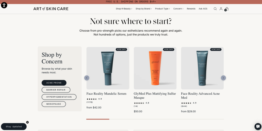
A complete redesign and rebuild of a Shopify skincare storefront — rebuilt on lightweight, native Shopify blocks from a Figma design, without losing a single piece of existing functionality.

Art of Skin Care needed more than a fresh coat of paint. The existing store had accumulated years of heavy, outdated code that was weighing the site down, and the design no longer reflected where the brand wanted to be. The goal was a full redesign and remodel — a modern, cleaner storefront that loaded lighter and faster, built to bring a new Figma vision to life.

The Problem

The original theme was bloated. Over time it had collected unused code and heavy customizations that slowed the site down and made it fragile to work on. On top of that, the store already relied on functionality the business depended on day to day — including a third-party app that manages customer accounts and reward points that shoppers could redeem. Any rebuild had to modernize the look and performance without disturbing what was already working.

The Solution

I rebuilt the storefront from the ground up using lightweight, native Shopify sections and blocks, stripping out the old, unused code that was dragging performance down. Working from a Figma design, I translated that vision into a clean, responsive theme — matching the intended layout, spacing, and styling while keeping the underlying markup lean and maintainable.

What I Did

  • Full storefront rebuild — reconstructed the site on lightweight, native Shopify blocks and sections instead of heavy legacy code.
  • Figma to storefront — brought a Figma redesign to life as a responsive, on-brand Shopify theme.
  • Performance cleanup — audited and removed old, unused code and bloat that was slowing the site down, leaving a leaner, faster-loading store.
  • Functionality preservation — made sure every piece of existing functionality kept working through the redesign, from browsing and cart to checkout and customer accounts.
  • Third-party integration — kept the external rewards app that controls customer accounts and redeemable points fully intact and functioning after the rebuild.
  • Careful, incremental rollout — rebuilt and tested methodically so nothing broke on a store the business actively relies on.

Tools & Tech

  • Platform: Shopify, with native theme sections and blocks built in Liquid.
  • Front end: HTML, CSS, and JavaScript, kept lightweight and maintainable.
  • Design: Figma, as the source of the redesign.
  • Integrations: a third-party rewards/points app for customer accounts and redemptions, preserved through the rebuild.

My Role

I led the redesign and rebuild end to end — turning the Figma design into a lightweight Shopify theme, clearing out the legacy code that was slowing things down, and making sure the store came out of the process faster, cleaner, and with all of its existing functionality intact.

Beacon is a multi-tenant SaaS platform for agencies and dev shops to estimate, manage, and bill client project work — from the first quote to the final payment.

Small software agencies juggle clients, project estimates, tasks, developer time, and invoicing across a mess of disconnected tools. Beacon unifies all of it into one platform. A company signs up, invites its team, and runs the entire delivery lifecycle in one place: clients → projects → tasks → estimates → tracked time → payments, with built-in team chat and notifications.

The Problem

The people doing agency work rarely have a single source of truth. Estimates live in spreadsheets, tasks live in one tool, time tracking in another, chat in a third, and invoicing somewhere else entirely. Context is constantly lost in the gaps between those tools, and nobody can see the whole picture of a project from quote to payment.

The Solution

Beacon gives each organization one isolated workspace that covers the full delivery lifecycle. An admin self-registers, chooses a plan, and invites teammates by email; from there the team manages clients, spins up projects and tasks, estimates the work, tracks time against it, and gets paid — without ever leaving the app. Team chat and notifications are built in, so conversations stay attached to the work they are about.

Core Features

  • Multi-tenant workspaces — every organization is fully isolated; one company’s data can never leak into another’s.
  • Role-based access — Admin, Manager, and Developer roles with per-organization permissions.
  • Onboarding by invitation — the admin registers and picks a plan, then invites teammates by email. Invitees follow a secure tokenized link to set their own password under the company — no shared credentials.
  • Clients, Projects & Tasks — with three task views: a grouped List, a drag-and-drop Kanban Board, and a planning Calendar (drag tasks onto days, with due-date handling).
  • Estimations workflow — developers submit hour/cost estimates; managers approve or reject; time is logged against approved estimates, or directly to tasks and projects.
  • Time tracking — start/stop timers with a live countdown in the browser tab, plus manual entries and one-click “log time” straight from task rows and cards.
  • Payments — developer payment calculation derived from tracked time and estimates.
  • Team chat — direct messages and group chats, including groups attached to a client, project, or task; image attachments, edit/delete, unread badges, and full-text message search that jumps you to the exact matching message.
  • Notifications — deadline reminders and activity alerts with read/unread state synced live across the app.
  • Subscription billing — seat-based Stripe subscriptions with a free trial. When a trial lapses without payment, a paywall gate locks access while preserving all data; paying restores everything instantly.
  • Deep customization — a drag-and-drop sidebar builder (reorder tabs, group them into dropdowns, hide any), dark mode, table density, per-user timezone, and notification preferences.

Tech Stack

  • Language: TypeScript, end to end.
  • Backend: Node.js + Express, Prisma ORM, PostgreSQL.
  • Frontend: React 18 + Vite + Tailwind CSS, with GSAP for interface animation.
  • Auth: JWT + bcrypt.
  • Infrastructure: Supabase (managed Postgres), Render (hosting), Stripe (billing), Cloudflare R2 / S3 (file storage), Resend (transactional email).

Engineering Highlights

A few pieces I’m particularly happy with (the multi-tenant architecture gets its own breakdown below):

  • Fail-closed subscription enforcement. Business routes return 402 the moment a trial expires without payment, but auth and billing routes stay open so a locked-out admin can still log in and pay. No customer data is ever deleted on lapse.
  • Env-gated integrations. Stripe, email, and object storage are all optional. The app boots and runs in any environment and only lights up the features that are actually configured.
  • Real-time-feel chat without WebSockets. Polling combined with an internal event bus keeps state in sync across components, so unread badges, message lists, and the notification/chat state all update together.
  • Rich drag-and-drop UIs on native HTML5 DnD. The Kanban board (with precise reordering), the planning calendar, and the sidebar builder all handle drop targets, insertion indices, and optimistic updates carefully.

My Role

Solo full-stack developer. I designed and built the entire product end to end — the data model, the backend API, the multi-tenant architecture, the frontend, the billing integration, and the deployment.

Tiara Contracting came to me needing a professional online presence built from the ground up, and I handled the entire website creation cycle myself, from securing the domain and setting up hosting, through design and development, all the way to launch and ongoing management. This was a true end-to-end build where I owned every stage of the process.

The project started with the client’s vision. I worked directly with Tiara Contracting to understand their brand, their services, and the impression they wanted to make on potential customers. From there I designed a custom layout tailored to a contracting business, clean, trustworthy, and built to turn visitors into leads. Every design decision was made in collaboration with the client to make sure the final result reflected exactly what they had in mind.

I developed the site in WordPress using Advanced Custom Fields (ACF), building custom, reusable content blocks so the client can update their content, text, images, services, and calls to action, directly from the dashboard without touching any code. All of the styling and layout logic was handled at the development level, so their team can manage the site confidently without ever worrying about breaking the design.

Beyond design and development, I took care of the technical foundation, including registering and configuring the domain, setting up and managing hosting on WP Engine, and handling launch and post-launch maintenance. Because I manage the site directly on WP Engine, I’m able to keep it fast, secure, and up to date long after the initial build.

Active Wealth Management needed a professional, trustworthy website befitting a financial services firm, and I handled the complete website creation cycle, domain, hosting, design, development, and client collaboration, from start to finish. As with all of my builds, I owned every stage of the process and delivered a finished, fully managed site.

The build began by working closely with the client to capture their vision and translate it into a design that communicates credibility and professionalism, qualities that matter enormously in the wealth management space. I designed a clean, polished layout and refined it collaboratively with the client until it reflected exactly how they wanted their firm to be perceived.

I developed the site in WordPress using Advanced Custom Fields, creating custom content blocks that let the client manage their messaging and pages without needing to touch code. The result is a flexible, maintainable site with a design system that stays consistent no matter how the content evolves.

What set this project apart was the compliance process. Because wealth management is a heavily regulated industry, the site’s content couldn’t simply be written and published. It had to go through several rounds of edits and review to ensure every claim, disclosure, and piece of language met regulatory compliance standards. I worked through each round patiently with the client, adjusting copy and structure until everything was approved, so the final site is both compelling and fully compliant.

On the technical side, I registered and configured the domain, set up hosting, and manage the site directly on WP Engine, keeping it secure, fast, and maintained well beyond launch.