Lucky Duck – Accessibility Audit and Remediation
A full accessibility audit and remediation of luckyduck.com. I reviewed every major page against WCAG 2.1 AA and fixed what stood in the way of compliance, from color contrast and typography to semantic structure and keyboard access, working with the client to keep it on-brand while making the store usable for everyone.

A full accessibility audit and remediation of luckyduck.com, every major page reviewed against WCAG standards, then fixed so the store is compliant and genuinely usable for everyone.
Lucky Duck needed to know where their store stood on accessibility and, more importantly, to fix what was falling short. I audited all of their major pages against the Web Content Accessibility Guidelines (WCAG), documented the issues, and then carried out the remediation, turning a list of problems into a store that meets the standard employers, customers, and regulators expect.
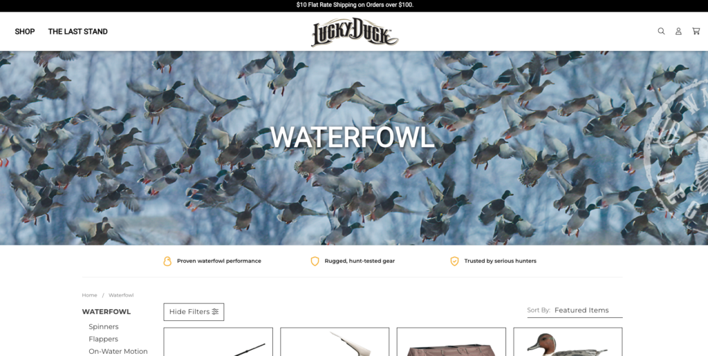
Why It Matters
Accessibility isn’t just a legal checkbox, it’s a better, more inclusive experience for every shopper, and non-compliance carries real risk for a business. The goal here was conformance with WCAG 2.1 at the AA level, the benchmark most organizations are measured against, evaluated across its four core principles: content should be perceivable, operable, understandable, and robust.
What I Did
- Audited every major page against WCAG 2.1 AA success criteria, combining automated checks with hands-on manual testing.
- Documented the issues. Insufficient color contrast, hard-to-read typography, missing or improper semantic structure, unlabeled controls, missing image alt text, weak focus indicators, and keyboard-navigation gaps.
- Fixed color and contrast. Adjusted colors so text and interactive elements met the required contrast ratios, without washing out the brand.
- Improved typography. Refined fonts and sizing for legibility and readability across the site.
- Collaborated with the client. Went back and forth on color and font choices to land on combinations that satisfied WCAG contrast requirements while keeping their brand identity intact.
- Strengthened the markup. Semantic HTML, proper heading structure, labeled controls, visible focus states, keyboard operability, and ARIA where appropriate, so assistive technology like screen readers can interpret the pages correctly.
- Re-tested after changes. Verified each fix against the guidelines to confirm the issues were actually resolved.
Standards & Approach
- Standard. WCAG 2.1, targeting AA-level conformance.
- Principles. Perceivable, operable, understandable, robust (POUR).
- Methods. Automated audits paired with manual review, color-contrast analysis, keyboard-only navigation testing, and screen-reader checks.
- Focus areas. Color contrast, typography and legibility, semantic structure, focus management, labels, and alternative text.
My Role
I ran the audit and carried out the remediation, reviewing the major pages against WCAG, prioritizing the issues, implementing the fixes to fonts, colors, and markup, and working with the client throughout to keep the result both compliant and on-brand.